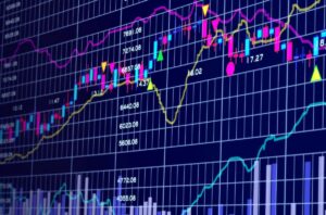
To study how a currency pair’s price shifts, you’ll need a way to look at both its historical and current price actions. You should also check the types of charts in forex.
A chart, or more accurately, a price chart, is the first tool that any trader who uses technical analysis must master.
A chart is simply a visual representation of the price of a currency pair over a specified time span.

It depicts the trading activity that occurs over the course of a single trading cycle (whether 10 minutes, 4 hours, a day, or a week).
We can use any financial asset with price data over time to create an overview chart.
Since price movements are a series of often random events, our task as traders is to manage risk and determine likelihood, and charting will help us do that.
Charts are user-friendly because they make it simple to understand how prices change. And it shows over time because they are so visually appealing.
It is simple to define and evaluate the movements, trends, and tendencies of a currency pair using types of charts.
The y-axis represents the price scale by(vertical axis) on the table, while the x-axis (horizontal axis) determines the time scale. We plot the prices from left to right across the x-axis.
The most recent price you will find is the furthest to the right.

Back in the day, charts were drawn by HAND!
Fortunately for us, Bill Gates and Steve Jobs were born, and they made computers available to the general public, so different types of charts are now drawn by machines.
What does a price chart represent?
A price chart illustrates supply and demand shifts.
At any given time, a chart shows any buy and sell transaction of that financial instrument (in our case, currency pairs). A chart includes all publicly available information as well as traders’ current expectations for future events.
Prices change again as the future comes and the truth differs from these assumptions.
The “future news” has become “established news,” and traders have adjusted their expectations for future news as a result of this new information. The loop continues.
Different types of Charts combine the operation of millions of market participants, whether humans or algorithmic trading bots.
A chart blends ALL of this information together in a visual format technical traders can research and evaluate, whether the transaction was caused by an exporter’s behavior, a central bank’s currency interference, trades made by an AI from a hedge fund, or discretionary trades from retail traders.
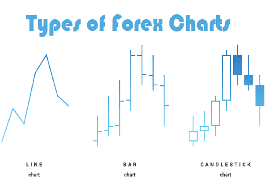
Types of Price Charts
Let’s take a look at the three most popular types of price charts:
- Line chart
- Bar chart
- Candlestick chart
Now, we’ll explain each of the forex charts, and let you know what you should know about each of them.
Line Chart
A basic line chart depicts a line drawn from one closing price to the next. We can see the general price movement of a currency pair over time by stringing them together with a graph.

Although it is easy to understand, the line chart may not provide the trader with much information about price actions over time.
All you know is that at the end of the day, the price was X. You have no idea what happened after that.
It does, however, make it easier for the trader to spot patterns and visually compare closing prices from one time to the next. This chart is typically used to get a “big picture” view of price movements. The line chart, which is essentially the slope of the line, also shows patterns the best. The closing stage, according to some traders, is more critical than the open, big, or low. Price variations during a trading session are overlooked when only the close is considered.
Here’s an example of a EUR line chart.

Bar Chart
This isn’t a bar chart, unfortunately.
A bar chart is a bit more difficult to understand. It displays the peaks and lows, as well as the opening and closing rates. A trader can see the price range of each time using bar charts.

From one bar to the next, or over a range of bars, the size of the bars can change. The lowest traded price for that time span is at the bottom of the vertical bar, while the highest price paid is at the top.
The vertical bar represents the entire trading range of the currency pair.
The bars grow larger as the price swings become more unpredictable. The bars get smaller as the price swings get quieter. Because of the making of each bar, the size of each bar varies. The range between the high and low price of the bar time reflects in the vertical height of the bar.
The bars grow larger as the price swings become more unpredictable. The bars get smaller as the price swings get quieter.
Because of the way each bar is made, the size of each bar varies. The range between the high and low price of the bar time is reflected in the vertical height of the bar.
With attached horizontal lines, the price bar also tracks the period’s opening and closing rates.
The opening price is represented by the horizontal hash on the left side of the bar, while the closing price is represented by the horizontal hash on the right side.
Here’s an example of a EUR/USD bar chart:

Take notice that the term “bar” will be used to refer to a single piece of data on a chart in our lessons.
A bar is simply a unit of time, whether it’s a day, a week, or an hour.
If you see the term “bar” moving forward, make sure you know what time period it refers to.
Since they show the Open, High, Low, and Close for a specific currency pair, bar charts are also known as “OHLC” charts.
The OHLC chart (open, high, low, and close) will display uncertainty, which is a significant difference between a line chart and an OHLC chart.
Here’s another example of a price bar:
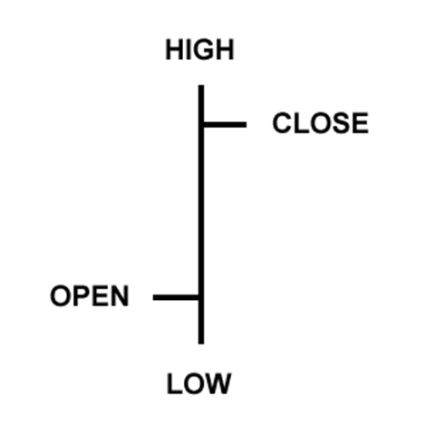
Open: The little horizontal line on the left is the opening price
High: The top of the vertical line defines the highest price of the time period
Low: The bottom of the vertical line defines the lowest price of the time period
Close: The little horizontal line on the right is the closing price
Candlesticks Charts
A variant of the bar chart is the candlestick chart.
Candlestick charts show the same price data as a bar chart but in a more visually appealing format.
This chart is popular among traders because it is not only more attractive but also easier to read.

With a vertical line, candlestick bars still display the high-to-low range.
The larger block (or body) in the center of a candlestick chart, on the other hand, shows the range between the opening and closing prices.
Candlesticks show “bodies” in various colors to help visualize bullish or bearish sentiment.
If the middle block is filled or colored in, the currency pair has traditionally closed lower than it opened.
The ‘filled color’ in the following example is black. The opening price is at the top of the block, and the closing price is at the bottom of the block for our ‘filled’ blocks.
If the closing price is greater than the opening price, the middle block will be “white,” hollow, or empty.

We spend so much time looking at charts that we believe it is easier to look at a colored chart.
Since a color television is superior to a black-and-white television, why not colorize those candlestick charts?
We actually replaced the white with green and the black with red. This means that the candlestick would be green if the price closed higher than it opened.
The candlestick would be red if the price closed lower than it opened.
In later classes, you’ll learn how to use green and red candles to “see” stuff on the charts more quickly, such as uptrends and downtrends, as well as potential reversal points.
For the time being, just note that we use red and green candlesticks instead of black and white on forex charts, and we’ll be using these colors from now on.

Here is an example of a candlestick chart for EUR/USD. Isn’t it pretty?

Since the same information appears on an OHLC bar chart, the sole aim of candlestick charting is to serve as a visual aid.
- The following are some of the benefits of candlestick charting:
Candlesticks are simple to read and understand, making them an excellent place for beginners to begin learning about chart analysis.
- Candlesticks are simple to operate. The knowledge in the bar notation adapts to your eyes almost instantly. Plus, studies show that visuals aid learning, so it’s possible that they’ll aid trading as well!
- Candlesticks and candlestick designs have catchy names like “shooting star,” which makes it easier to recall what they’re about.
- Candlesticks are excellent at detecting market reversals, such as from an uptrend to a downtrend or from a downtrend to an uptrend. Later on, you’ll hear more about this.
There are several types of charts to choose from, and one is not inherently superior to the other.
The back-end data of the chart may be the same. But the presentation of the data may differ.
Each chart will have its own set of benefits and drawbacks. For technical research, you can use any kind of chart or a combination of charts. It is entirely up to your personal preference.
Now that you know why candlesticks are so cool, it’s time to let you know that we will be using candlestick forex charts for most, if not all of forex chart examples on this site.
Putting It Together
Traders may use a variety of price charts to keep track of the foreign exchange market.
When you first start reading price charts, keep it easy.
Look for the right mix between getting enough information on the chart to make good trading decisions. But do not have so much information that it makes your brain slack. It won’t make ANY good decisions while you figure out your chart preferences.
Every trader will have a different approach to finding the right combination. So it’s important to start with the fundamentals before moving on to technical indicators.
Looking for a highly rated forex fund manager?
Fx Pips Guru has a strong group of forex experts. They manage the forex accounts of our clients from different brokers dedicatedly. Just hire our forex fund managers here : https://www.fxpipsguru.com/forex-fund-manager/ .